Performance Reporting: Big Numbers, Little Insight
By Matthew Lloyd (Director of Operations)
Reviewed and approved by James McKnight (Founder & CEO, Registered Portfolio Manager) — “The Prophet of Profit”

“Thus conscience does make cowards of us all.”
— Shakespeare, Hamlet
“Show me the incentives and I’ll show you the outcome.”
— Charlie Munger
When “You’re Up $100,000” Tells You Very Little
Not long ago, I asked a Vancouver prospect—a seven-figure account at one of the Big Five Banks—a simple question:
“How’s your advisor doing?”
They weren’t sure. So they sent over their statements…
Month after month, their “performance” was reported in absolute dollars only. “You’re up $100,000.” The actual percentage return? Shown just once a year. And even then, only as a single blended figure for each account.
No equities vs. bonds. No U.S. vs. Canada. No attribution. No benchmarks. Just one number, once a year. Yikes!
If this appears likely to impress rather than enlighten, you’re not wrong.
What Do Absolute Returns Say About Performance?
Hmmm, let’s see… Oh right, not much.
Sure, it feels good to see your account up six figures. But context is everything:
- A $100,000 gain over ten years is a lot less impressive than the same gain in one year.
- A $100,000 gain on a $1 million portfolio is decent. On a $100,000 portfolio, it’s spectacular.
Absolute returns tell you how many dollars you made. Relative returns—expressed as percentages—reveal whether those dollars are impressive or disappointing once you factor in time, starting balance, market performance, inflation, and risk.
It’s like bragging you ran “five miles”—without saying whether it took 30 minutes or three hours. Sounds solid, but it doesn’t tell us if you’re a marathoner in training or just late for the bus.
Why Do Some Advisors Report This Way?
Big Numbers, Happy Clients
Humans are gloriously irrational. As Brase (2009) showed, people respond more strongly to whole numbers than equivalent percentages. Say “a million people are affected” and it feels urgent; say “1%” and it feels abstract.
The same thing happens with investing. Tell a client, “You made $1,000,” and it lands with weight. Say, “You’re up 10%,” and it invites questions—compared to what, over how long, and is that actually any good? Percentages are more informative, but dollars feel more tangible.
Best practice, as Brase himself suggests, is to show both: dollars to help clients feel the gain, percentages to actually understand it.
Surely advisors know this. After all, if they don’t understand the implications of performance reporting, do you really want them managing your money?
The Bare Minimum
Canadian regulators only require firms to report a single annual money-weighted return. That’s it. No requirement for monthly percentages, asset-class breakouts, or benchmark comparisons. So a number of banks do what’s cheapest and safest—tick the box and move on.
Patriotic Camouflage
Canadian advisors often overweight Canadian equities. You could call that loyalty—we call it mediocrity. The S&P/TSX has consistently lagged the S&P 500. Over the past 10 years the S&P/TSX Composite has achieved total runs of 11.32% vs the S&P 500’s 15.59% (in CAD, as of Sept 19, 2025): 1
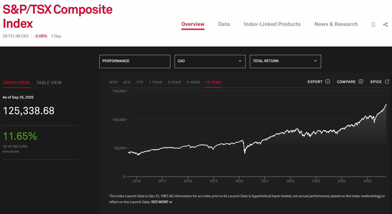
Source: S&P Global
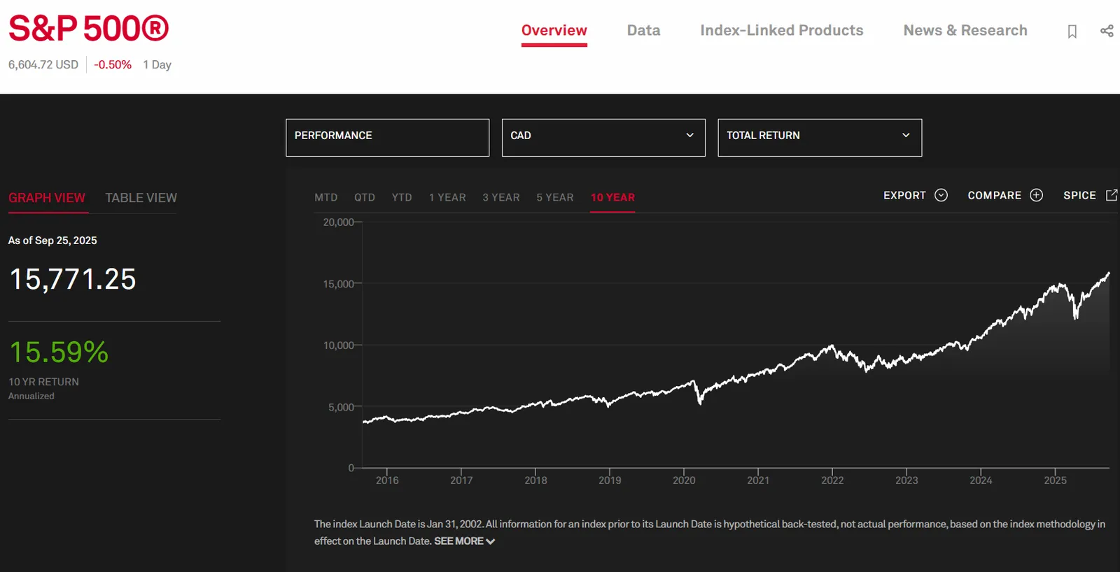
Source: S&P Global
A regional breakout would show what home-country bias is costing you. Blended numbers make sure you don’t see it.
1All data is for industry context only, not a direct comparison to WPM’s strategy or results. Past performance is history, not prophecy—and your results will differ.
Blended Numbers, Missing Answers
A single return won’t tell you:
- Were your bonds dragging while stocks carried the day?
- Did Canada crawl while the U.S. ran?
- Was your advisor’s asset allocation adding value—or subtracting it?
When it’s all lumped together, who can really say?
Pulling Teeth Performance Reports
After wading through a series of unenlightening reports, I drafted a polite letter the prospect could send to their advisor. Nothing dramatic—just a request to see performance reported in percentages, broken out by asset category. Basic stuff.
The advisor’s reply? Apparently, the request was so unusual they couldn’t generate it and had to send it to head office. Keep in mind, this was not a rookie. This was a very senior advisor, one who only takes million-dollar accounts, backed by one of the largest financial institutions in the country.
Six weeks later, a report finally arrived—for one of three accounts.
Bonds Behaving Badly
Now, if you’ve read this blog before, you’ll know I’m no fan of traditional 60/40 portfolios (60% equities, 40% bonds)—I’ve even asked outright whether it’s dead, or deserves to be.1 In particular, I’ve been a consistent critic of bonds, which over the past decade have barely limped along at 1.93% annually on the S&P Canada All Bond Index (as of Sept 19, 2025):2
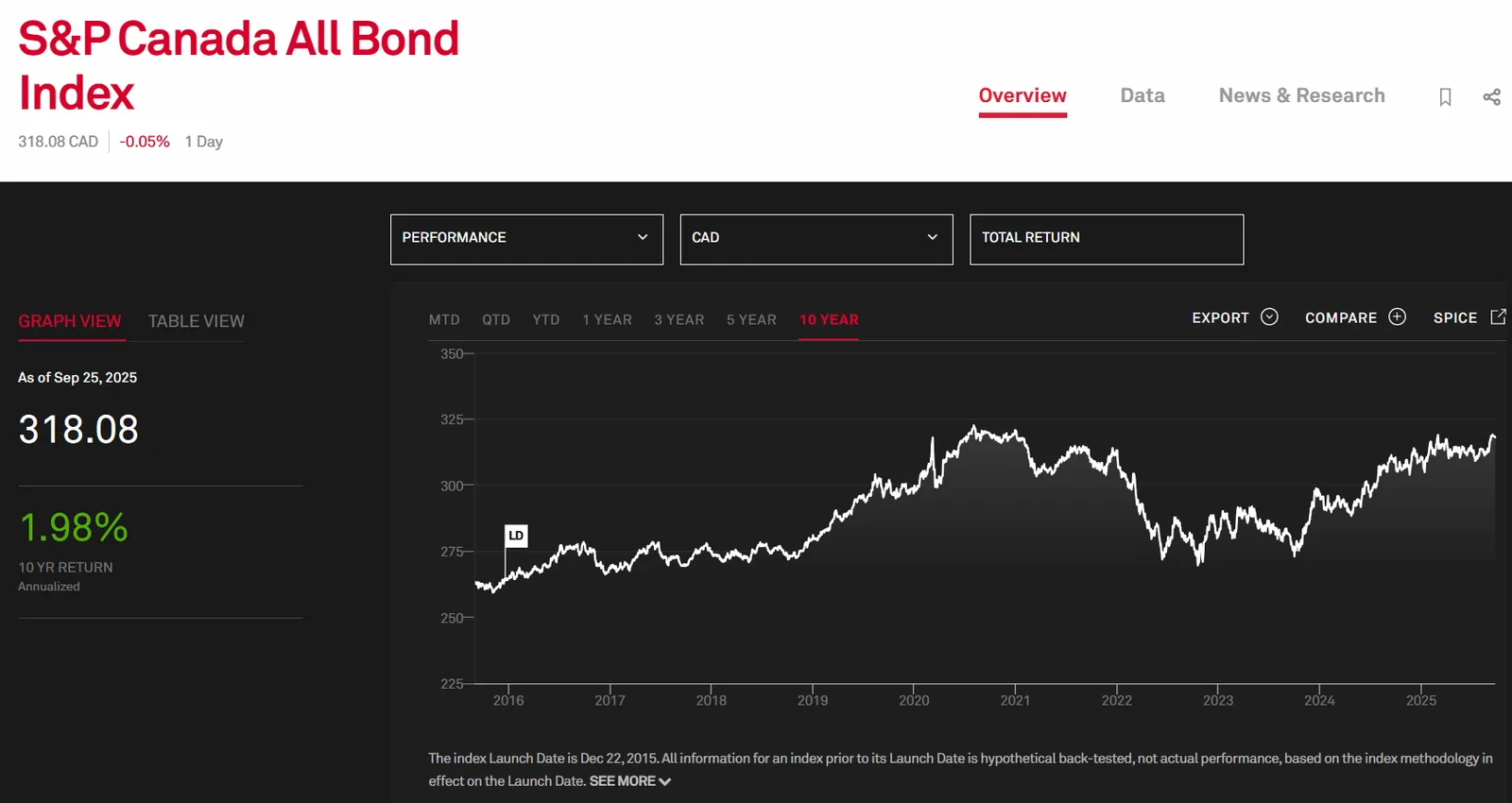
Source: S&P Global
So, what do the numbers reveal about this prospect’s portfolio, about a third of which is in bonds? Brace yourself:
In one of their accounts, the fixed-income portion had earned an annualized 1.75% return since 2016. Adjust for inflation, and that drops to –0.84% in real terms.
That’s right—fully one-third of this client’s portfolio has been dead weight, costing them purchasing power month after month.
1Just because we think bonds have been a raw deal for most Canadian investors doesn’t mean they’re wrong for everyone. They may suit conservative investors who fear volatility more than low returns, or those who need liquidity for near-term expenses. Context matters, and every portfolio should reflect the investor’s actual needs.
2All data is for industry context only, not a direct comparison to WPM’s strategy or results. Past performance is history, not prophecy—and your results will differ.
Would Your Advisor Tolerate Their Own Reporting?
Ask yourself this: how do you think your advisor reviews their own portfolio? Do they settle for a single blended percentage once a year, without knowing how each part performed? Equities versus bonds. Domestic versus international. What professional wouldn't demand that level of detail when it’s their money at stake? Should clients accept anything less?
What Good Performance Reporting Looks Like
If you’re proud of your work, you don’t bury the numbers—you show them. At minimum, that means:
- Returns in absolute and percentage terms, on every report
- Returns by asset class and geography, so you know what’s pulling its weight.
That’s not complexity. That’s transparency.
Why This Matters
Poor reporting isn’t harmless. When professionals do good work, they show it. Why should investing be any different?
Without proper breakdowns, you don’t know:
- If your bonds are even keeping up with inflation.
- If home-country bias is quietly costing you
- If your advisor adds any value at all.
In our experience, most Canadian investors don’t have a clue how their portfolios are performing. And being proverbially polite, it rarely occurs to them to demand better. It’s almost as if expecting more from investment professionals is considered bad manners.
At Wealth Preservation Management, we think differently. We’re proud of our performance, which is why it’s right at the top of our homepage. And for every client, we report quarterly results in percentages, account by account. Frankly, it never occurred to us that anyone would do otherwise—until we saw it firsthand.
So the next time your advisor pats you on the back and says, “Congratulations, you’re up $10,000,” ask the crucial question:
Relative to what?
Curious how your portfolio is really performing? We’ll run a free analysis of your investments and show you the results in plain percentages. Contact us today.
Ka-ching, the check is in the mail.